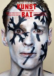
Going back in time: Daniel Gould’s 3D List, Art in Amsterdam #46


Well, 3D was reporting, last fall, the revival of the Amsterdam art market; lots of red dots where sprouting. Then the new year came and, damn, it seems as if a virus hit the city's galleries and the red dots have been few and far in between.
One gallery holder told me, last week, that during February, and after 15+ years in the business, she was asking herself, "Maybe I should be doing something else." There is not a logical explanation since all economic factors are showing increases from company' profits to increased employment numbers. You gotta do your part!
Of course, 3D could put the blame on himself since I have not been reporting on What You Have Missed since last November. But that would be egotistic for me to think that I had such an impact on the art buying habits of the Dutch public. And as to the fact that the "3D List" has been on hold, here is the latest. I appealed to Meldpunt Discriminatie: Regio-Amsterdam. They sent a letter to dienst@oba.nl which replied to that with the same exact "offer" that was made to me last November by a supervisor at the new Openbare Bibliotheek. When I pointed this out, I was told, by Meldpunt, that they could do nothing and that there where NO discrimination laws in the Netherlands. Huh? Again, Hans van Velzen (dir@oba.nl) is the man to direct your letters to if you want the return of the "3D List."
INDEX:
Bits & Pieces:
Museum Reviews:
Rijksmuseum: Metsu;
Van Gogh Museum: "Picasso in Paris, 1900-1907;"
Stedelijk Museum: "Temporary, Part 2;"
Hermitage-Amsterdam, "Splendour and Glory, Art of the Russian Orthodox Church." + Restaurant Review
Bits & Pieces:
The Rijksmuseum has announced the appointment of Jane Turner as the new Head of the Print Room as of 1st September. She is an American and a specialist in Dutch 16th and 17th century drawings. The Rijksmuseum Print Room is one of the top five in the world with more than 800,000 paper-based works.
***
Christa Meindersma has been appointed the new director of the Prince Claus Fund for Culture and Development. She is an international lawyer by training and most recently was the Deputy Director at the Hague Center for Strategic Studies.
***
Did you know that the first audio tour of a museum exhibition occurred at the Stedelijk in 1952?
***
Laser 3.14 says, "Bathing in River of light and Everlasting Glee." At Nieuwe Kerkstraat 5.
***
Quote: "Architecture is an abstraction of nature."
***
The wisdom of the comic strip: First character: "Texting...facebook...Twitter...Fantasy Leagues...All this so called social networking is just a soulless waste of time...People use to enjoy being alone in their thoughts...Now it seems like that's every one's biggest fear!" Second character: "Maybe we should just start an anti-social network." First character: "Other than being an oxymoron, that's brilliant." Non Sequitur. 11th January. 2011.
***
MUSEUM REVIEWS:
Gabriël Metsu: A master rediscovered
Rijksmuseum Amsterdam
Well, this is embarassing. I have misplaced the notes I took concerning this exhibition; I have now made three searches but to no avail. Therefore, the review will probably be shorter than the exhibition deserves. Sorry.
Gabriël Metsu (1629-1667) is not a 17th century Dutch artist that is well known even to those who think they have a knowledge of that century's Dutch artist. I speak from personal experience. A year before this exhibition opened I was at a press showing at the Rijksmuseum and it was announced. We were taken into a gallery to look at one of his portraits that was hanging there. My first thought, how his style was so like Johannes Vermeer; especially the light.
When you see the exhibition you will undoubtedly think the same and why not? Until the late 19th century, many Vermeers were misidentified as being by Metsu. They were contemporaries and were born in the same neighborhood: Metsu, Lieden (he moved to Amsterdam in 1654, at 25) and Vermeer in Delft. It is estimated that there are about 25 known and authenticated Vermeers and about 130 Metsus. So why Vermeer took prominence over the last 100 years is any one's guess. Obviously, they knew of each others work and style. Whom influenced whom is not really an important issue. What each did speaks for itself and beautifully so.
A brochure visually compares two works by Vermeer and two by Metsu. Vermeer's "A girl reading a letter by an open window" (1657), and Metsu's "A man writing a letter" (1664-1666), show that there are similarities in composition, subject matter and light. The other comparison is of Metsu's "A woman reading a letter" (1664-1666), and Vermeer's "The love letter" (1669-1670), and there is, again, an uncanny similarity. In one case, Vermeer's work came first and in the second example it was Metsu that may have been the influence. But, despite their similarities, their paintings are very different in both atmosphere and technique. Was one a better painter---or artist---than the other? That's like comparing apples and oranges. They were both masters. And both painted several masterpieces.
Metsu was a noted genre painter in Amsterdam and painted scenes from history, portraits and still lifes. There are 35 examples in this excellent exhibition.
Damn, I just noted, in a brochure, that the show closed the 21st of March. Sorry about that.
***
Picasso in Paris, 1900-1907
Van Gogh Museum (Paulus Potterstraat 7)
When you attend a museum exhibition you expect to see an artist's masterpieces. Perhaps everything hanging doesn't really fall under that classification, but a significant percentage should. The current show, at the Van Gogh Museum, titled "Picasso in Paris, 1900-1907" has only a few "masterpieces," but, for any afficiano of his work, this is a must see exhibition. Must see because in a sense a more accurate title would have been "The roots and formation of a master." And the show has taken four years to piece it together.
At the age of 19, Picasso left Spain and came to Paris. His "training," up to that point, had been mainly at the feet of his father who taught at an art academy. His knowledge of art styles had been limited to what he could see in the museums of Spain. Paris was an eye opener to the young man. The Louvre was a mind-boggling experience. The Paris art community, his training ground. And it was in Paris that he came face-to-face with the Impressionist. A whole new world. It was staggering. It motivated him, inspired him and drove him to work at a furious pace.
The early part of this period is most famous for "The Blue Period." The inspiration to that was an emotional one. One of his first friends, in the city, was an artist by the name of Carles Casagemas who committed suicide in 1901. That event had an enormous emotional impact on the young Picasso. His paintings became more somber, dark and with much melancholy and we see a metamorphosis from the portrait-like style to the symbiotic rendering. But there was a great deal more to his oeuvre, at the time, than this.
You will be surprised to see how many different styles are represented. You will also be surprised to see works that look like they could have been done by Steinlen, Toulouse-Lautrec, Degas and Cezzane. And they look that way because Picasso had not only a good eye, but the skills to copy another artist's style. He did it intentionally because it gave him an understanding to their technique. Even Van Gogh is represented; in fact, in the 50s, Picasso would claim that he was a modern day Vincent. He was fashioning his own education.He was looking for his style.
During the summer of 1905, Picasso traveled to the Netherlands to the seaside resort of Schoorl. You will see "Three Dutch Girls" a beautifull and colorful gouache on paper work. It was during this period that the blue period faded into the "warm hues of pink and red." His trip to Holland was probably motivated by his friendship with the Dutch artist, Kees van Dongen. There are four works in the show that could have been painted by this fauve artist; the colors, the style and even the brush strokes are all Van Dongen. It was no accident. They were neighbors. Back in the 80s, I spent an afternoon with Van Dongen then 80 year old daughter, Dolly, in Paris. She regaled me with stories about the Paris art scene from her youth to her middle age. She told one story about how she had awakened late one night and her parents were not at home; they had gone to a party. She wandered from the house and into the narrow lane, outside her door, and the wind slammed it shut. She became frightened and began to cry. A man came up to her to ask what the matter was? Choking back tears she explained the problem. The kind man invited her to his place down the lane to await her parents return. He became friends with the parents. His name? Picasso.
Much of the work on display is done on cardboard. There were two reasons for this: 1. It was cheap. 2. Oil paint dried more quickly on cardboard than on canvas. These are a few of the small gems of trivia that you will come away with from this excellent exhibition of a painter becoming a master. The show concludes with the year 1907 and these two works: "Female Nude with Arm raised" (pastel, chalk and led pencil on paper) and "Study for Les Demoiselles d'Avignon" (pencil and pastel chalk). Two seminal works that were the prelude for Cubism. This exhibition is the road map to how the master got to where he was going before he knew what his destination was. Don't miss it.
Performance: Each Friday night, during the life of this exhibition, there is a performance by the Dansgroep Amsterdam titled NOMADE. It is choreographed by Krisztina de Chatel and has been inspired by Picasso's Blue and Pink periods and specifically with his themes revolving around burlesque and the circus. Three men and one women---two in Harlequin costumes---perform a conceptual dance. One man is continuously "walking" on a large ball. A very stocky man---and nothing like what you would expect physically of a dancer---lends a rather disassociated presence. Oh, yeah, there is also a full scale horse. The opening scenes are without sound. The "dance" is reflected on the back wall in shadow. Then the woman mounts the horse and about five minutes later there is a roll of drums and this is followed by music hall' sounds and the dance becomes more animated. The duration of the piece is about 25 minutes.
It is presented every Friday night through to 27th May and at two times: 19:30 and 20:45 and at no extra charge.
The exhibition, itself, closes 29th May.
The Catalog:
Marilyn McCully, a leading expert on Picasso, is both the curator of the exhibition and editor of the catalog. In addition, she has contributed seven chapters.
In the first, "Picasso Discovery of Paris," she tells us that he came to Paris for two reasons: 1. As a journalist for "Catalunya artistica" assigned to cover Exposition Universelle (1900); 2. One of his paintings, "Last Moments," had been selected to be exhibited at the Grand Palais. You will learn, too, that Picasso did not intend to stay and didn't. He would return to Spain, but after a series of disappoints related to his art, he decided that his future was in Paris. The suicide of his friend, Casagemas---which launched his "Blue Period"---was another contributing factor. He returned to stay. The catalog follows the early years for a young person growing into a man.
There are a total of 80 photographic reproduction of Picasso's work done between 1900 and 1907. An excellent----and very revealing---overview. Included are a few works not in the show. There is also work by Van Gogh, Van Dongen, Daumier, Derain, Cézanne, et al alongside a derivative piece by Picasso. All the important facets of his time in Paris between these pivotal dates is fully covered. A reading of it will give one more than an introduction into the future master; it will give you an understanding of everything that came after 1907. A student of art becoming an artist.
The reproductions are beautifully realized and the layout is both clean and elegant.
Available in English, Dutch, French, Spanish and Catalan. @ 29.95 euro, 256 pages with 175 illustrations. Paperback.
***
Temporary Stedelijk 2
Stedelijk Museum (Paulus Potterstraat 13):
For the new Stedelijk Museum's director, Anne Goldstein, her experience thus far must seem like it is a combination of the Kafkaesque, a journey with a white rabbit into Wonderland and an odyssey all mixed into one adventure or maybe misadventure. The latest, almost surreal event, was the bankruptcy of the construction company, Midreth, that was building the new wing. Fortunately, another company stepped into the void and not too much time was lost. But, somehow, Goldstein continues to function, admirably, like nothing has happened.
Her second show, that carries the apt title Temporary Stedelijk 2, brings us closer to the normal and what to expect for the future. On exhibition there are the masterpieces from the permanent collection to new acquisitions. And many nice and unexpected surprises. As an example, as you ascend the grand stairway, to the upper floor, your attention is immediately galvanized on the lobby's "lighting." The lighting is actually two massive light installation works by Dan Flavin (USA). One is titled "untitled (to Piet Mondrian through his preferred colors, red yellow and blue)" and it dominates every section of the four walls. It is bold, dramatic and monumental and all this in a subtle sort of way. The style is simple with circular fluorescent lights attached perpendicularly to linear tubes. It is a spectacular display with 80 separate fluorescent light units. The second Flavin piece complements alll of this by becoming a halo in green as an accent. The green linear fluorescent tubes ring the overhead skylight. It is on loan from the Flavin family. Both would make for an outstanding permanent piece to the museum's collection because it defines the space brilliantly; a perfect juxtaposition of the old and the new.
From the lobby, you enter the Grand Gallery which has been segmented into three sections allowing for more work to hang; and the arrangement also puts the majestic Matisse collage into not only a new context but a more dramatic setting then the small gallery it occupied before the renovation. It hits you as you come through the doorway, into the gallery, and you have a distance that allows for its full appreciation. In the same gallery, on the east end of the room, there is an abbreviated selection of Piet Mondrian's work ranging from his Naturalistic period to the linear abstractions You will see a compact overview of the latter style from the years 1920 to 1929.
He shares the space with with the Russian Kazimir Malevich and his works dating from 1915 to 1927. They make a perfect contrast to the Mondrian selections. Both were seminal to the 20th century modern art movement. At the opposite end of the Grand Gallery is work by later 20th century artist: Ellsworth Kelly, Barnett Newman, Brice Marden and, the American female artist, Jo Baer who has made Amsterdam her home for the last 30 years or so.
Just off the Grand Gallery a surprise awaits. There are five patinated bronze expressionistic figurative sculptor works by Willem de Kooning done in the early 70s. I have had a strange history with appreciation for this artist work. I saw my first show of his work at the Chicago Art Institute in the late 60s. I didn't like it! I took a dislike to him personally, too. The show consisted of his series of expressionistic black "portraits" of ladies. I thought him a misogynist. The opinion changed when I viewed his expressionistic landscapes that have been hung in the Stedelijk over the years. I was also unaware of his sculpture work until seeing the pieces now on display. Complex in form and visually captivating.
And more surprises...The first show of the Temporary Museum featured graphic work by Willem Sandberg, the museum's director after World War II. Linear notes explained that many posters designed during his reign, as director, were, in fact, from his own designs. This current show continues our education of the man who stands out as probably the most influential and innovative director of the museum during the 20th century. There are vitrines that display more of his graphic work. From April, 1943 until May, 1945, he was in hiding because he was part of the resistant underground fighting the Nazis. During this period, he amused himself by producing 20 manuscripts under the collective title "experimenta typographica." The works are exquisitely made note books consisting of collages, graphic design and typography. Nice!
And there is more design. A corner gallery has a collection of furniture by both Dutch designers---like Gerrit Rietveld to Piet Hein Eek---and non Dutch---like Charles Eames. There are also other examples by lesser know designers. Another small gallery has eight vitrines displaying examples of new jewelry. The style ranges from simple forms to whimsical and conceptual to the kitschy. Something for everyone.
Look for the room with the mirror composition. It is a composition that's always changing----right before your eyes---and never the same. They are eight mirrors that revolve 360 degrees thus reflecting not only the room and the viewer, but the outside as well. Simple, but fascinating. It is by Germaine Kruip (NL, 2004).
Olivio Martinez Viera (USA/Cuba) shows six works on paper from 1970. Two are about 3.5x6 meters. Big and dramatic! They were originally commissioned by the Cuban government, in the mid 60s, as posters "to mobilize the Cuban society to support and achieve an unprecedented level of [sugar] production." These are reprints of the originals. Bruce Nauman's X-Rated and provocative five meter long neon sculpture is back in all it fascinating debauchery, great colors and continuous action. They must be on Viagra.
In the ground floor galleries, in the east wing, you will find an eclectic mix of work. There is a gallery with Alexander Calder's (USA, 1898-1976) mobiles. He had a whimsical approach to everything he created. He was first befriended by Willem Sandberg when they met in Paris in 1937. Sharing the space is another creator of whimsical sculptures or objects---hard to classify---Jean Tiguely (Swiss, 1925-1991). He made "kinetic machines" that he refered to as "anti-machines." On view is his "automated writing machine" sitting atop a rectangular box "decorated" with "graffiti" which consist of signatures, signs and initials.
"Bewogen Beweging" was an unusual initiative organized in 1961 by Daniel Spoerri, Willem Sandberg, Pontus Hulten (Swedish museum director) and Jean Tiguely. The exhibit consisted of 222 works by 72 artists and was "a comprehensive survey of art about movement." At the time, the critics said of the show: "Ho-hum." But, 50,000 visitors came over a five week period to view the works. One wrote to Sandberg, "I hope it will please you to hear that an unsuspecting conservative appreciated this show that is stupidly laughed at by so many." On display is more ephemera consisting of correspondences along with photos.
There is much video art to be seen as well. And it spans from early items from the 70s and up to the present. In one room there are several video screens (14 to 20?) lined up and stacked together. Only one video is shown at a time. You will need two hours to see them all.
The exhibition is scheduled to continue through the summer months. More info at: https://bit.ly/2HgDUVe
***
Splendour and Glory, Art of the Russian Orthodox Church
Hermitage-Amsterdam (Amstel 51):
Ho-hum was my first thought when I received the first press announcement concerning the current show at the Hermitage-Amsterdam. Religious art? Boring. Especially if you had been raised in the Catholic Church and inundated with religious icons, of many forms, from the time you were six years old and starting school---the school day began with Mass---and looking at the same religious objects and scenes more than 4,000 times over 12 years until graduation. I have been to Italy and did the Vatican and Florence. I admire Da Vinci and Michelangelo. But, hey, I have seen it all...Or so I had thought.
The director of the Hermitage-St. Petersburg said that this show had three themes: 1. Art that is inspired by religion; 2. The discovery of this religious art first noted in the 19th century by western curators artists and collectors; and 3. The story of the Russian Orthodox Church itself and its relationship with the country's rulers. And you get it all from the 6th century to the 20th. And an evolution of iconic art from the 12th to 20th century. A thousand years of outstanding Russian art; 350 religious artifacts.
You start in the main gallery with the theme of the Orthodox feast of "Pascha" (Easter) as the high point; the czars and their "private churches," the saints; religious heirlooms from the 15th to 17th century when Moscow was the center of religion and art. On entering the main gallery there are eight 14th century frescoes in various states of preservation. You will be amazed that the Hermitage would allow them to travel. They look that fragile. Then there is the "The Miracle of St. George and the Dragon" a work from the late 17th century. Kandinsky, over a hundred years later, would use the same pose to do his own rendering of St. George. The large icon paintings are in remarkable condition. Very well preserved. And it will become apparent that well into the 17th century the style was naïve. And the liner notes are exceptional in their detail. The focal point of one large painting is surrounded by 20 individual boxes and each with its own painted scene. A schematic diagram numbers each and describes it like: #5, Torture on the wheel."
A five meter high gold framed partition shows 11 icons from the Church of the Assumption in Paromenya and dates from 1613. Again, liner notes describe each section. A large glass case exhibits elaborate gold and silver chalices, incense burners and clerical robes. An even more amazing is a hug silk tapestry-like painting measuring about five meters by four plus meters. It is from 1695 and illustrates over 100 individuals. On the left side are the saints and on the right side both saints and earthly people. Unfortunately, it is hung in a location where you can't get any distance and it is too high from the floor. With that said, there is another view and that is from the balcony of the upper gallery. However, from that perspective the lower quarter is not visible and the light is poor. Opposite is "Alexander 1st's traveling (campaign) iconostasis" which went with the tsar throughout the 1812 War and foreign campaigns in 1813-1814. It is in six panels. The liner notes describe each.
The side galleries, along the main one, shows smaller pieces. There are wooded and painted chalices; small icons and an incredible wood and silver "book." The four panels of wood are framed and hinged with silver moldings. Each section contains about 70 miniature carvings of saints and religious scenes. Wait until you see the "Saints' Calendar." It consist of 12 A5 paintings on enamel and each divided into the number of days in the specific month and each day illustrated with one to several saints. An interactive video screen allows you to select individual months which are then magnified. Touch a "day" and you get a description in either Dutch or English. Cool! Opposite this is an elaborate icon with nearly 1,000 miniature paintings of saints and with labeling.
What would the "Pascha" be without Easter eggs? Don't expect the elaborate gold and jeweled Faberge examples, but you won't be disappointed. These are fashioned from glass and ceramic and decorated with paintings of saints and sometimes gilded with gold. A nice touch is that they have been collected into an Easter basket.
In the upper galleries you will see coins and a commemorative stone with Greek inscription which is dated "6021." It is from the 6th century and the dating refers to the belief that that was the number of years since the creation of the world. There are 35 symbols. One gallery offers a very interesting and revealing video history of religion in Russia and the USSR from 1900 to 2020. It chronicles the twist and turns that affected the Russian Orthodox Church. I can only say I learned a lot and it wasn't the show I expected.
Free English tours on Sunday at 14:00.
The Catalog: "Splendour and Glory: Art of the Russian Orthodox Church." Authors: S. Tomsinsky, I. Barinova, M. Yevtushenko, O. Maltseva and S. Nilov.
A catalog for an exhibition of art can't get much better than this. And even though it is bound as a paperback it is lavishly done. As I paged through, I read again the captions on individual pieces I had seen and admired. But as I did so, several pieces got my attention that I had not given much time to or had forgotten or just overlooked. And regrettably so. So many, in fact, that I wondered if everything in the catalog is on show. Doesn't matter, but, I guess, I'll have to go back. Also, like all good catalogs, it sells you on the idea of returning.
The catalog---and the show---goes beyond a style in a period of history in art. It is a history of a significant period of nationalistic development. A history of religious development, its suppression and its rebirth as a focal point in society.
Then there is the reproduction detail. A good example are the Easter Eggs on display. The catalog not only pictures them as you see them in the exhibit, but alongside that photo is another which labels each egg with a number so you can identify it and read the caption notes on the lower page. Another very good example is the full page photo of "The Resurrection and the Descent into Hell, with Feast-Days and Passions of Christ, Annual Mineia and Miraculous Icons of the Mother of God." Phew. Some title, but wait until you see the work. One another page is a description---again with schematic numbering---of this complex multi-figure composition. The avant garde term conceptual redundancy is very accurate terminology to describe its style.
If you don't take home the catalog, you missed half the show. Until 16th September.
ISBN: 978.90.78653.25.7, (English); 978.90.78653.24.0 (Dutch). 248 pages and 350 illustrations. Price: 29.95 euro.
Footnote: The Hermitage always serves the press lunch. Much appreciated since the offerings are always, in someway, special. And since the opening of the main space, they have been exceptional. Part of the reason is that the lunch, indirectly, promotes the restaurant which is at the entrance to the museum, the Neva, named after the river that St. Petersburg is built on. Generally, I wouldn't even mention this courtesy, but it was so exceptional that I feel it must be applauded.
It was inspired by two things: the Russian table and the season. The chef of the Neva creates new dishes to correspond to each new exhibition based on these two criteria. He is very secretive as to what it will be and introduces it on the official opening day of the show. Perhaps this is a sneak preview.
The main course was a salmon loaf. The fish was moist and flavorable and the pastry crust crispy. There was a chaffing dish filled with creamed mushrooms. I asked if it was meant for the salmon and was told, "It's up to you." I covered half the loaf with the mushrooms. Roast potatoes in a very pleasing sauce plus shredded and seasoned cabbage which was rich and very tasty. There was also Russian egg salad served with two types of Russian bread. A bowl of tartar sauce was an added condiment; I covered the other half of the salmon loaf with it. Of course, the final evaluation must wait for the tasting. There was not one false note to any of the dishes. Each nicely seasoned, perfectly cooked and the ingredients obviously top quality.
The Neva is open from 10 in the morning to one in the morning, long after the museum has been closed. Take in the exhibition, relax with a drink at the long bar and cap it all with dinner. Not a bad way to spend the day.
WHAT YOU MISSED:
"Sukebeningen" or "Scheveningen." (Some confusion here. The invite used the latter title, but the program listed the former.)
STEIM (Utrechtdwarsstraat 134) is an avant garde post grad school for new music and sounds. And you get even more. Years ago, there was a monthly program, presented on Thursday, that 3D never missed. It has been nearly ten years since it became history. Pity. But the magic goes on. Through the month there are various programs. Several are offered for FREE and the others, generally, never cost more than 5 euro. And you won't believe what you get for the money. Last Sunday was a perfect example.
The invitation described it thus: "Seven Japanese artist work on a multi-sensory performance program. The Scheveningen Project....creates multidimensional works of art based on characteristically Japanese eroticism. We explore the cultural differences in the conception of eroticism from the many different angles such as music, electronics, dance, fine arts and olfactory art." I had no idea what to expect. Was there to be an evening of Japanese pornography? Naked ladies...and, maybe, even a few naked men? And also mentioned was "music, dance and a performance." You had to make reservations and it was apparent, by the fact that there were but two or three empty seats, that many people were probably not as ignorant as to what to expect as I was.
The opening piece, called "Moon," set the tone for the evening in a very minimal way. We were requested to shut off our cell phones. We were told that the room would go to total darkness. What followed was a truly intimate sound experience. It reached your senses on different levels and in various ways. Because the room was dark, all your attention was on the sounds. You could get a feel of what it must be like for a blind person. You have read that those who are sightless have an enhanced perception of sound. And it is true. The sounds---as opposed to being music---were atonal cords which you approach on that other level of hearing them in the intimacy of total darkness. The high points had the resonance of the sounds of a thunder storm and sometimes even the abruptness. I love thunder storms---and especially the lightning---it is one off the few things I miss about America...But, I digress.
At one point, the music faded in and out while a woman breathed like she was in the act of making love. We had been sitting in the dark for perhaps ten minutes when, suddenly, I felt a hand against each side of my skull which then followed its outline down to my neck. It was so gentle that the sudden shock of being unexpectedly touched was no more than a start which quickly dissipated and my body relaxed to the pleasant and intimate sensation. The person had to have been wearing night goggles (I later talked to someone who professed knowledge, of the event, that no night goggles were used). But the show was just beginning.
There was a huge screen at the front of the room. It came alive with dimmed light and a woman appeared behind it. She began a choreographed strip. Erotic to be sure, but certainly not pornographic in any sense. There were nuances to the act in that the light intensity changed and the different brightnesses and contrast added to the figurative abstraction of the act. Cool!.
There was an intermission so that the room's seating configuration could be changed. The second performance was much more complex, intense, expressive and mind blowing. Titled, "48 Kama Sutra," is was a breathtaking performance both visually and musically. The dancer, Chiaki Horita, catalogued the 48 positions of the Kama Sutra, alone, and in a continuous flow. The music was supplied by two musicians; one playing about ten "instruments" like a snare drum, a block of wood, three bells, et al with two wooden mallets. The other musician played a string instrument with about 15 strings. The program notes explained that the sounds were based on the actual sounds heard in the yukaku (Japanese red light district).
But back to the dancer. The physical demand on both her body and her endurance made you wonder how it was possible. And the imagery...Was it pornographic? Again, no, but it was erotic and in both an artistic and non sexual way. There was no easy nudity to tantalize nor overt sexual-like projection to titillate. Just the grace of the body in motion. I had but one criticism. The lighting was such that the audience was visible. It would have been even more dramatic had spots lights been trained on the musicians and another following the dancer around the floor.
The final act, "The Tattooer," was, once again, minimal in music and expression. But don't get me wrong, the dancing was impressive and energetic. This time, the lighting was right on.
Nearly forgot. There was another sense level to be experienced. Maki Ueda (Japan/Netherlands) is an 'olfactory artist." She uses smell as a medium. Scents were interspersed throughout the room during the performance. Fantastic!
Chiaki Horito (Japan/Netherlands) is both a dancer and choreographer. Ryoko Imai, (Japan/Netherlands), percussion; Noriko Koide (Japan/Netherlands) is a music composer; Mini Koto (Japan/Netherlands) is a pianist; Yuki Hatazawa (Japan/Netherlands) is a graphic artist; and Yota Morimoto ((Japan/UK) is a composer exploring unconventional approaches to generating and transmitting sound. All are Japanese, but all are now students in the Netherlands or the UK.
...And the entrance fee was five euro. It could be 1950 all over again. It doesn't get any better!
***
Jimmy Kets is showing at De Brakke Grond (Nes 45) in an exhibition titled, "Brightside/Shot in Flanders." He does color photography and with humor. His scenes could not be more ordinary, but it is the way he captures the imagery that makes you take notice. He uses, essentially, a technique that I have coined the phrase "decomposition-composition" to describe it. As an example, the camera focuses on a chair with a package of Marlboro's laying on the seat. To the upper right is a woman in a red dress with a deep cleavage but her head is cropped out. The colors are bright and the lighting, too, is special though almost invariably he uses only ambient light. Until 17th April.
Restaurant Review:
Often De Brakke Grond passes out hapsje from the Belgium style restaurant which is part of the complex. The invite for the Kets show mentioned a special evening called Diner Pensant. It would consist of seven courses at only 30 euro (28 euro if paid on line prior to the event). It sounded like a good deal to 3D. We were invited to sample "sumptuous Flemish dishes and Belgium beers."
An aperitif was served to the guest as we entered the restaurant as the "first course." The second consisted of a white shredded radish with walnuts, a mustard sauce and a cheese mousse. Fresh on the palate and a nice balance of flavors. The beer was Suvée René Lindemans which is fruity with a pleasant and sweet aftertaste. This was followed by a soup course with an interesting combination of delicate flavors. The main ingredient was a fish, smoked sprot which is a variety of herring. But it was so understated that you didn't expect that there was a fish base. Topped with shredded witloof and sla.
The next course was a multiple experience with a trio of blood sausage examples. Picky eaters generally avoid blood sausage if only because of the name. Pity. It is delicate and subtle in its flavors and the three varieties bare out the complexities of making it. A rhubarb chutney, sweet, was to me more of a compote. But lets not quibble over terminology because it did compliment the sausage. The beer was Palm.
The main entree was simple. Small Dutch shrimp piled high over mashed potatoes with a buttermilk puree and watercress. Tasty and very filling. The beverage was Rodenbach. It is a mild in alcohol, 5.2%, as compared to most Belgium beers, and it has a sweet-sour taste with a fruity ambiance. Most refreshing.
A nice selection of three cheeses: Le Petit Lathy, Le Doré de Lathy (Oboth biological) and a goat cheese. And the beer was Trappistes Rochefort (8%) a fitting finale to a very interesting and untraditonal meal in any language.
***
Hey, folks, that's all! I had meant to include reviews of recent gallery shows, but time has run out. It is 16:55 and the free Internet connection I make use of pulls its plug at 17:00. Now I must go to another location where I can "cut & paste" and transfer rhese pearls of wisdom to the blogspot. It is not possible to do so at this location. Life is hard!
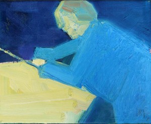
Photo: Hmmm...This looks interesting. 3D considering one of the FREE posters by Jakob Kolding at his SM Bureau Amsterdam opening...But what is it? Photograph By: Piet van der Meer
http://gould3dlist.blogspot.nl/
Reageren
- Login of registreer om te kunnen reageren


